Colours of the year? Why…
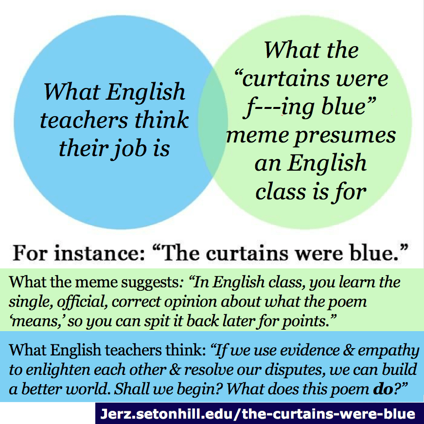
Pantone has labelled its colors of the year for 2021, and they’re very much a reflection of how the world is feeling during COVID-19. For more than 20 years now, Pantone Color has studied the world for its colour influences, delving into the areas of entertainment and fashion, socio-economic conditions, and travel destinations, among other things. This isn’t a case of the curtains just being blue (the internet’s best analogy for over-analysis).
Colour psychology has always had an inherent presence in design, and there’s no doubt that it influences our psyches. This is particularly so in times where our attention spans are shorter than those of goldfish.
And no matter how you choose to look at it, there’s no denying the sense of satisfaction derived from looking at aesthetic things in our favourite colours. A purple room could be awry to your friend, but it might look like a million dollars to you. But with said friend’s preference for black, it’s possible you would want to slap a label on them that says “basic”.
Maybe Pantone’s Colors of the Year 2021 will spark some joy
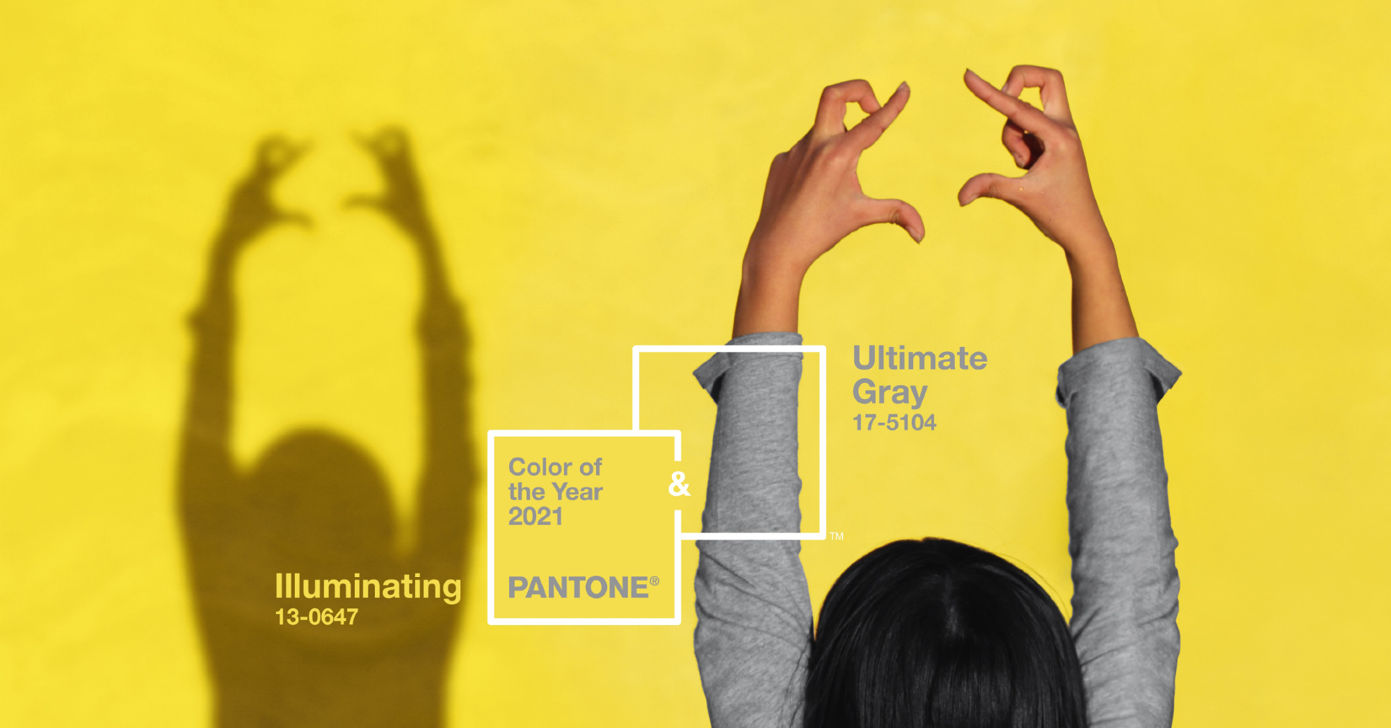
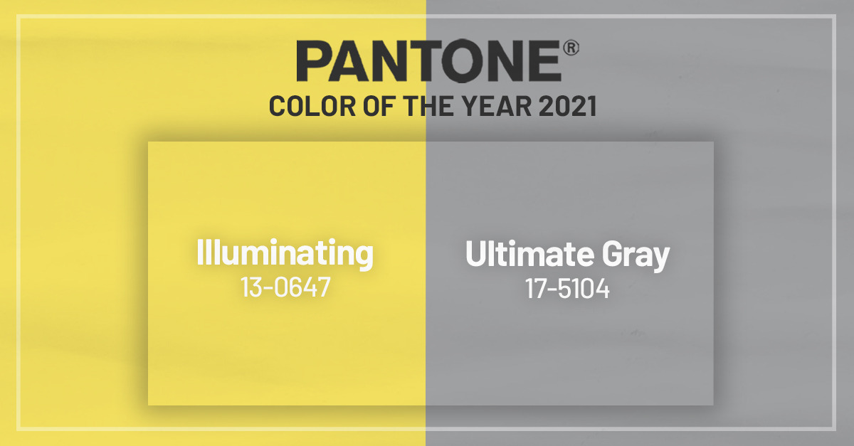
This year’s colours are about collaboration, two largely independent elements coming together to pose a supportive mood. The choice sees the union of PANTONE 17-5104 Ultimate Gray and PANTONE 13-0647 Illuminating, which are a specific shade of grey and yellow, respectively.
In an online statement, Pantone said that these colours were chosen out of a need for the world to feel like things were looking up. They remarked that this feeling is essential to the human spirit. “It is a story of color that encapsulates deeper feelings of thoughtfulness with the promise of something sunny and friendly,” the brand wrote.
PANTONE 13-0647 Illuminating is labelled to be a shade that sparkles with vivacity and empowers its viewer. The PANTONE 17-5104 Ultimate Gray is regarded to portray everlasting dependable elements that provide strong foundations. Whether your spirit lives in these shades of yellow or grey, they’re both just as important to keep the world going in 2021. And if you’re a sceptic nodding off at the thought of what these colours mean, you can at least appreciate the fact that they complement each other.
Which leads us to our next talking point — Pantone has labelled their colours, big deal, does this even matter?
What do these colours mean for the world in 2021?
The PANTONE Colors of the Year are regarded with deep respect, and they are, actually, a very big deal. If you hadn’t heard of Pantone before reading this article, you’re probably a little confused.

Pantone is the first company in the world to have ever developed a colour matching system. Prior to 1963, designers and printers still argued on how their colours’ shades were supposed to turn out. More often than not, how colours turned out printed were based on how printing companies interpreted a colour. But after the Pantone’s Matching System (PMS, ha-ha) was introduced, designers were able to describe the exact colours that they wanted via Pantone codes.
It was from that day forth that Pantone came to be known as the world’s authority on colour – deservedly so.
So here’s what’s going to happen in 2021. Because of how well-regarded Pantone’s yearly colour curation is, we’re going to see much of product development, purchasing decisions, fashion, home furnishings, industrial design, product packaging, and graphic design feature this year’s Pantone colours: the PANTONE 17-5104 Ultimate Gray and PANTONE 13-0647 Illuminating.
Pantone has helped brands leverage the power of psychology and emotion when designing their colour strategies. And when examining the colours that the company has chosen for the year, they seem like exactly what the world needs to recover from a painful pandemic. Yellow will uplift as grey will lay the foundations for ease of mind, and perhaps those will be the colours that speak to you more in 2021. And no matter, you’re going to be seeing those colours used together at a large frequency.
Incidentally, yellow is the colour for Gen Zs
The iconic Millennial pink has found its counterpart in Gen Z yellow. This time, it’s in a colour that’s said to be a natural evolution of Millennial pink – dubbed off of Pantone’s 2016 colour of the year, Rose Quartz.

For a long time now, Gen Z has been regarded to be the generation of people who are insistent on making a statement and taking the world by storm with creativity. So it makes sense that their colour is one that’s so hard to miss, brimming with vibrancy, zest, and optimism.
Wanna rock these colours?
Gen Z Yellow and Pantone’s Colors of the Year 2021 are all the rage in the fashion world right now. If there’s ever been a time for you to blend in bold colours, it’s probably now, particularly with the revival of glorious 1980s style.
Replace your neutral basics with pops of yellow, or switch your typical essentials for Pantone’s colours instead. If you’re rocking both colours, they’re likely to vibe off of each other with balance and tastefulness. And if you feel like donning a completely yellow statement piece, you do you – it’s the entire point of this season in fashion!
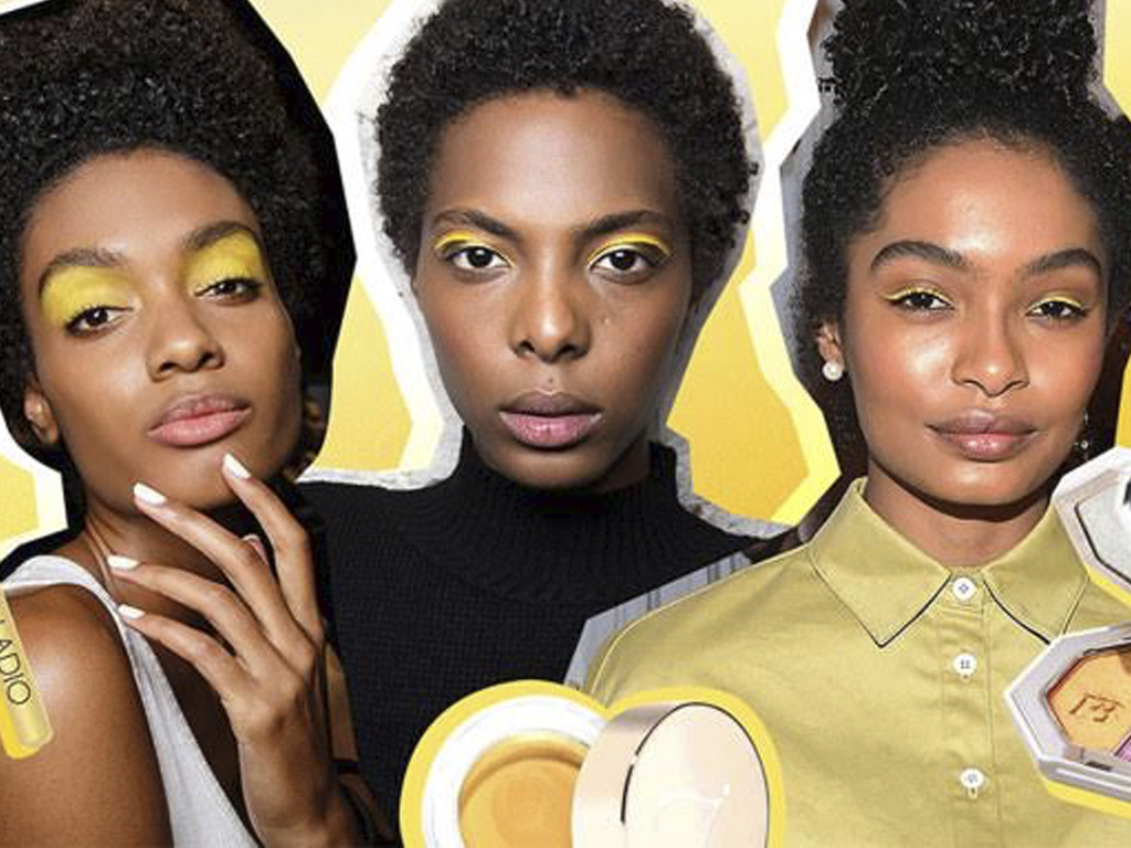
But if you’re looking to keep your wardrobe slim, consider incorporating these colours into your nails and your make-up instead. Yellow is bound to give the perfect electric backing for the perfect grey winged eyeliner. And if you want to keep things simple, treat yourself to a fresh manicure and leave it at that. You’ll groove right into 2021.
Join the conversations on THG’s Facebook and Instagram, and get the latest updates via Telegram.
